Thursday, 12 April 2012

Week Five & Six :: Project Two


Learning Centre Exemplar Analysis 

Surry Hills Community Centre [

- Environmental Atrium filtering cleaning of air as it comes down through the building
- Air brought in from top of building (cleanest), funnelled down a series of glass shafts, washes over a series of filters – including using plant material to organically filter the air).  Then passed around the excavation of the building known as the thermal labyrinth – this naturally cools the air before it goes back into atrium space – back filter through and into the building.
      Power generated on site
      Automated devices (including louvers automatically responsive to the sun)
      Services – two floor library (ground and lower level), Surry Hills Neighbourhood Centre and Function Hall (level one – provides advocacy and information to the local community, also run markets, classes, etc) 26 place child care centre (level 2)
      Free Wi-Fi


Reflection:
The main thing that appeals to me about this learning centre is the childcare facility on the top floor. I particularly like the open room (featured in these two photos) where the focus is on play and the opportunities for “fun” appears unlimited thanks to the openness of the space. I like the idea of incorporating something like a sandpit (as in the Surry Hills child care facility), garden or small waterpark-type area into my learning centre; focusing on natural resources to teach the importance of the natural environment and our natural ecosystems such as the mangrove ecosystems. 

Week Five & Six :: Project Two


Learning Centre Exemplar Analysis 

Rolex Learning Centre; Lausanne Switzerland [by Tokyo based Architects SANAA]

-       The aim was to provide (for the university campus) “a place to learn, to obtain information, and to live”.
-       The building has been designed to be open and free flowing.
-       “Round courtyards provide light and focus the continuous space”.
-       One of the main concepts behind the design involves relating the building back to the natural landscape (mountainous). The building has an undulating form; even sections of the floor are domed; representative of the rolling landscape beyond.
-       Building spans a large area but is low to the group – so not to block the views beyond – rather to echo them
-       One main entrance to the building provides a clear entrance axis.
-       Spaces within are defined by contours of the floor, circular light wells and patios.
-       Different views from within the building allow visitors to connect to the space and orientate themselves.
-       “The proposed program [of spaces] offers a new living space, opens up the possibility of new teaching approaches, everything being integrated into one single building as place of assembly and breeding ground for enriching encounters and synergies”.  


-       Open 7am – 12am
-       Intended as a place not just for university students but for members of the public to explore.
-       Architects thought of the building more as a “park”.
-       Organic movement through the building.
-        Creating set paths (straight lines) we can only create crossroads – curves and more organic space we create diversity with interaction – create “dynamic interaction”


Reflection:
      This library, I feel can only work on a large scale because its overall form is based on large spanned domes and the availability of a large area of land. The form is fairly complex and inside it appears to be a bit of a maze with only the view of outside allowing one to orientate themselves inside. Many people have blogged about this library and some have the opinion that much of the interior space is wasted with steeply sloping and arched floors that cannot be used for study areas or storage areas for books and resources. I do see their point and can acknowledge that there would not be a place for a building with this form like this one in every city. However, the architects explained that this building was built to function more as a “park” for the entire community, rather than just a study space for the University’s students. I see that the architects responded to their site probably in a similar way to how we responded when designing our folies at the Howard Smith Wharves. By this I mean that they have interpreted the site as having one key element and from there, formed a concept and developed a very literal design based on this. In their case this concept was the rolling hills and it is clear that they have succeeded in responding to the site and making the most of the views to the bay. I plan to respond and go about the design process in a similar way to design my library. 


Week Five & Six :: Project Two


Learning Centre Exemplar Analysis 

Kindergarten Terenten [Feld72]


-  Located in a Mountain Village in South Tyrol, Italy
-  South Tyrol is a border region; an area defined by the overlapping of three cultures; this is expressed through the architecture.
-  Mountainous region – the building was designed to fit within its environment
-  Building emerges from the site – from one side it appears to be a clear building, on the other it looks as though it is part of the landscape.
-  The scale of the building is relative to the surrounding village development and considers the perspective of the users; children.
-  The design concept of this building “is intended to give meaning and identity to this defined space – something special amid an everyday environment without generating jarringly harsh contrasts”.
-  Three different buildings “houses” are on the site – connected by glazed walkways. These buildings are different shapes and designed with the children in mind – the different shapes help the children to get their bearings and “understand the spatial and social organisation”.
-  Aimed at creating “differentiated spatial structures, rooms that provide as much potential as possible to simulate children’s independent activities, orientation, communication, social interaction and aesthetic receptiveness. Rooms that can be flexibly used as stages for children’s activities, but also as quiet retreats”.
-  Windows placed around the day care centre draw different views of the mountains into the building.
-  From each classroom children can access the garden.


-       Building links nature and architecture
-       Part of a new kind of learning revolution that will inspire and encourage “imaginative minds”. 


Reflection:
I do enjoy the overall aesthetic of this childcare facility; however, it was actually the picture of children in the small room, with green foam pieces (seen above on the right) that attracted me to this building. I find the use of humble spaces like this one really intriguing and imagine they’d be really inviting for children; similar to spaces in those maze mania type places (as shown in the photo directly above). I like the fact that the main elements to this building include natural light and open space and the fact that the building has quite clearly been designed in response to the surrounds; not to blend in but to work in cohesion with the surrounding architecture and with the mountain it is located on.  


Week Five & Six :: Project 2


Learning Centre Exemplar Analysis

Caboolture Hub [Peddle Thorp Architects]

-       Hub is to be a community meeting place with a library, art gallery, learning and business centre, café, retail outlet and creative studios all within the precinct.
-       Activities and features of the library include family and local history area – genealogy and local heritage resources, an area dedicated to Aboriginal and Torres Strait Islander culture known as the Welcoming Place, study spaces with in corners and pockets of the library’s main resource and collection area, meeting rooms, and a computer classroom that can be hired out, a teen zone with online gaming facilities, reading collections and “chill-out” space and a children’s area with educational toys and resources as well as an interactive tree – “which brings the outside into the library”.


- The hub was born out of the need to develop a “life long learning” facility for the Caboolture area that uses space efficiently and effectively. The hub was developed on the site of the town square with the idea that it would be prominent and accessible to the community. 


- The building has been designed -     so that it meets a number of different needs to facilitate the entire community – from young children to retirees.
    -  The spaces are designed to be flexible and somewhat ambiguous in their uses, with the building being      largely open plan and easy to move through. 


 - Building was to  “promote life-long learning and play an important role in the cultural fabric of this region”.
-       A number of free events and workshops are also offered through the library – for everyone from babies through the seniors.


- A number of energy efficient features incorporated within the building including the use of a lot of natural light, water recycling facilities, the use of materials suited to the environment and climate of the area and low energy consumption (with quality equipment selection and passive design principles). 


My Reflection:
The Caboolture Hub is one of the most relevant exemplars to our design project. The building; although designed on a much larger scale and as a complete learning centre precinct, can be drawn from extensively to gain ideas and inspiration for our learning centre. The library incorporates a number of different resources and flexible spaces in which to learn. There are a number of organised and disorganised activity spaces; particularly for young children and teenagers; I will draw on these ideas when researching activities to incorporate into my library.  One particular space mentioned very briefly is the “interactive tree” in the childrens area. From what I can deduce the tree functions as a cubby space with desks to draw, colour and read at and as a storage area for books. As my folie concept and learning experience is based around the mangroves, I feel as though incorporating something similar to this tree into my library’s children’s centre would work well.  I also like the aesthetic of the hub and the variety of spaces (both indoor and outdoor) that the building provides. As my concept is so linked to the natural environment I do feel it will be important to have both indoor and outdoor spaces; perhaps combine the two.


Week Five & Six :: Project Two


Learning Centre Exemplar Analysis


Seattle Library [Rem Koolhaas]


- Main challenge with this site is the 8.8m height difference between the boundaries on two different streets.

- “Although the library is sculptural, it is not in any way an attempt to make a form. The library’s appearance comes from pushing boxes around to stay within the height and setback restrictions and zoning codes”. – Architect Joshua Ramus, partner at the Rem Koolhaas Office for Metroplitan Architecture. 


- Spatial organisation -     is the most important and defining feature of this library.
-     Each platform is flexible in it’s function but still defined and organised into “spatial compartments” with specific functions.
-     One of the first operations when reforming the library was to consolidate all the spaces and define platforms according to a more specific purpose; this included defining their size, level of flexibility, circulation palette and structure amongst other things.
-     The spaces between the platforms are the intermediate spaces; as you move from one functional space to another.  


Reflection:
The design of this library, at first, appears to be based on the architect Rem Koolhaus’ ideas and experiments with sculptural form. Instead; however, this library is about efficiency of space and organisation. There is a big emphasis placed on the collaboration of the library resources and the time spent organising the “platforms” of the library around the most ergonomic and resourceful use of every space within the building. The library’s form itself was developed in response to maximising its size according to regulations, height restrictions and setbacks. I think the shear scale of the building and the number and prestige of the resources it houses make it hard for me to look to this building for direct ideas and inspiration for my library at the Wharves. I can; however, appreciate its organisational system in the sense that platforms are broken up to serve specific functions and different spaces within these platforms serve further functions. 


Wednesday, 11 April 2012

Week Five & Six :: Project Two


Learning Centre Exemplar Analysis

Royal Library Copenhagen [Schmidt Hammer Lassen]

-       One of the most significant architectural landmarks on the Copenhagen waterfront. Building is known as the “Black Diamond” – clad in black granite with clean-cut surfaces and sharp angles.
-       Located on the river front in the historic part of Copenhagen; its redevelopment has prompted a development boom along the waterfront. 
-       Surrounded by a number of important historical buildings including the Danish Parliament, Christiansborg Palace, The Danish State Archives and a number of significant Museums.
-       The library incorporates a number of different facilities including a café and a restaurant, a bookshop, exhibition space, scientific and literary institutions, a roof terrace, a 600-seat concert hall/ conference space.
-       Old library (dating back to 1906) linked to new building through a clear axis; this is demonstrated literally through the walkway over Christians Brygge (a main road separating the new building from the old). The axis runs through to the atrium of the new building on the water front. 
-       Glazed section breaking up the solid black granite exterior – providing insight into the dynamism of the space inside. The central open atrium is naturally ventilated and enables travel throughout the building. It also provides most of the natural light to the building’s inside spaces.  
-       Building appears to be “floating” on the water with a glazed vertical strip running along the base of the building (as seen in this picture).


-       Building broke from tradition designed in 1993 with construction finished by 1999.
-       The building’s inclined river façade, reflection across its shiny surface, glass panel along the bottom giving the appearance of “floating” and the placement of windows, etc all suggest movement. This is in contrast to the feeling of solidarity and rigidity suggested because of the shear size and presence of the structure.
-       Interior of the building is designed to be vastly different from the exterior – atrium has a very organic form – wave like shaped mezzanines appear to be cutting through the building. There is a lot of natural light penetrating this space and the view out to the harbour also adds to this feeling of the organic.  Light also penetrates through from a large skylight in the atrium; this, along with the glass curtain wall looking over the water outside are the two main sources of light.


Reflection:
I do find it slightly more difficult to relate to this building; perhaps because of its scale but I think more because of its huge façades. I find the building to be very dominating in the site; but that’s not to say that it’s not successful. I particularly like the façade of the building that is seen from the river with the glass atrium in the middle. It responds to its surroundings in a different way to most of the other buildings I’ve examined. It stands in stark contrast rather than trying to mimic or fit in with the surrounding buildings. Perhaps; however, the key element to this building is the use of highly reflective materials on the exterior including glass, and most predominantly black granite that picks up and echoes reflections of the water and the surrounding buildings and the movement of traffic and pedestrians outside. The use of these materials well and truly gives the building the prestige it needs to exist in this area of the city; surrounded by a number of important historical buildings I’ve realised that it needed to be dominating and “heroic”. Inside I think visitors would be surprised by the buildings lightness and openness. The atrium is filled with these free-flowing forms that are the floors of the library, with mostly very open plan spaces existing within the floors. The building appears to respond well to the needs of the city and, at a closer look, also responds to the surrounding streetscape and riverfront. I probably won’t take much inspiration from this building for the overall design of my learning centre as I feel that the Howard Smith Wharves don’t really call for such a grand scale building; but I do like many elements of this building as I have mentioned above.     

Week Five & Six :: Project Two


Learning Centre Exemplar Analysis

Halmstad Library [Schmidt Hammer Lassen]


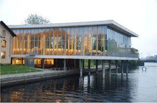
-       Set in a parkland space on the Tiver Nissan, overlooking Halmstad’s historical core. It has a concave façade with double height glazing, set around a circular atrium with a large existing chestnut tree. Nature, the seasons and the city all become part of the library.
-       Inside, the library is essentially open plan and the glazing on the external walls allows interaction between internal supporting columns and tree trunks outside.
-       Materials include concrete, glass and Nordich Larch [wooden] flooring.


- “The library entrance is designed to engender a feeling of dynamism, movement and activity”.
 On the entrance floor; the middle level (of three floors) is the reception area, the café, the news section, the children’s section, the city gallery and the fiction section. The Upper level houses the non-fiction section, the Europe direct office and the local history section. The lower level houses the stockrooms (both public and private), three study rooms and the auditorium.
- The form is modelled around trees that stood at the site – with a number of vertical concrete columns and two concrete planes running horizontally.


-  Interior is light and airy and can be easily negotiated by visitors


     - The Library; through its design, acts to link the historic part of Halmstad and the newer developments previously divided by the river. The building extends out, over the river as if to merge the two. 


Reflection:
The Halmstad Library appears to be one of the most humble and simple buildings of those I’ve examined; however, the concept is probably conveyed most effectively (at least I feel I can understand it most clearly). I really like the building aesthetically, I feel it responds to its surrounds completely appropriately; set on the edge of a river around a large chestnut tree. Almost every external wall of the building is glass with the building’s concept revolving around the representation of trees that use to exist at the site. In this representation the vertical columns inside the building act as the stumps of the trees and can be seen from both inside and outside the building. I feel as though this concept of nature and the environment; with both the columns and the open atrium surrounding the chestnut tree help bring the outside and inside together. The building was designed to provoke a feeling of dynamism and movement; I believe its interaction with the outside environment; including the trees, the river and the surrounding buildings and city scape as well as the activities that take place inside, all aid in bringing these feelings to life to the building.   


Week Five & Six :: Project Two


Learning Centre Exemplar Analysis

Birkenhead Library and Civic Centre [Archoffice]


  • Concept – looking through ancient trees that use to exist on the site through to the view beyond. Thus, solid, void, transparency, light quality, pattern and form were key design elements focused on for this project.
  • The intention was for light to penetrate the building, with the intensity of light inside and the reflections it makes subtly changing throughout the day until the building becomes completely transparent at night.
  • The building is set in the centre of the Birkhead business district within the Neil Fisher War Memorial reserve; with views from the area of Rangitoto Island, Coromandel Peninsula, the Auckland CBD and the Waitakere Mountains.
  • Specific and shared spaces – cost effective.
  • Meeting rooms that can be accessed outside of library time.
Use of Materials:
  • Brick – both internally and externally mimics that used in the historical Plunket building that use to occupy the site.
  • Screening vertical “fins” on the western façade are made of Laminated Purple Heart and Alaskan Yellow Cedar – sculptural and functional providing shade from the sun.
  • Laser cut perforated sheets internally act as vertical screens. Similar perforated ceiling panels also act to dapple light through from roof lights and act to aid ventilation with smoke and air extractors on the roof above.
  • Lightweight concrete used as it reduces the level of insulation needed.
  • Timber “fin” detail used on balustrades.


My Reflection:
The concept behind this library is one of the more successful and interesting out of the exemplars I looked into. This, in part, is because the design concept is fairly relevant and applicable to that of my folie’s concept.  While I do like this building, I feel as though I will be looking to convey the concept of mangrove roots more obviously than the architects of this learning centre have conveyed their concept of looking through ancient trees. The building is quite busy in terms of material use; I will be using only a few key materials in my design. I do; however, feel as though this concept is strong and particularly like the architect’s use of perforated laser cut screens and their use of glass; to help bring the natural environment in.