Learning Centre Exemplar Analysis
Halmstad Library [Schmidt Hammer Lassen]
-
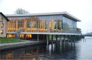
Set in a parkland space on the Tiver Nissan,
overlooking Halmstad’s historical core. It has a concave façade with double
height glazing, set around a circular atrium with a large existing chestnut
tree. Nature, the seasons and the city all become part of the library.
-
Inside, the library is essentially open plan and
the glazing on the external walls allows interaction between internal
supporting columns and tree trunks outside.
-
Materials include concrete, glass and Nordich
Larch [wooden] flooring.
- “The library entrance is designed to engender a
feeling of dynamism, movement and activity”.
- On the entrance floor; the middle level (of
three floors) is the reception area, the café, the news section, the children’s
section, the city gallery and the fiction section. The Upper level houses the
non-fiction section, the Europe direct office and the local history section.
The lower level houses the stockrooms (both public and private), three study
rooms and the auditorium.
- The form is modelled around trees that stood at
the site – with a number of vertical concrete columns and two concrete planes
running horizontally.
- The Library; through its design, acts to link the
historic part of Halmstad and the newer developments previously divided by the
river. The building extends out, over the river as if to merge the two.
Reflection:
The Halmstad Library appears to be one of the most humble
and simple buildings of those I’ve examined; however, the concept is probably
conveyed most effectively (at least I feel I can understand it most clearly). I
really like the building aesthetically, I feel it responds to its surrounds
completely appropriately; set on the edge of a river around a large chestnut
tree. Almost every external wall of the building is glass with the building’s
concept revolving around the representation of trees that use to exist at the
site. In this representation the vertical columns inside the building act as
the stumps of the trees and can be seen from both inside and outside the
building. I feel as though this concept of nature and the environment; with
both the columns and the open atrium surrounding the chestnut tree help bring the
outside and inside together. The building was designed to provoke a feeling of
dynamism and movement; I believe its interaction with the outside environment;
including the trees, the river and the surrounding buildings and city scape as
well as the activities that take place inside, all aid in bringing these
feelings to life to the building.


No comments:
Post a Comment